INSTITUTION: Hanoi University of Science and Technology (HUST)
GRAPHIC DESIGNER: lE cHI
ILLUSTRATION: lE cHI
CONTENT & PHOTO: ccpr (CENTER OF COMMUNICATION AND PUBLIC RELATION) – hust
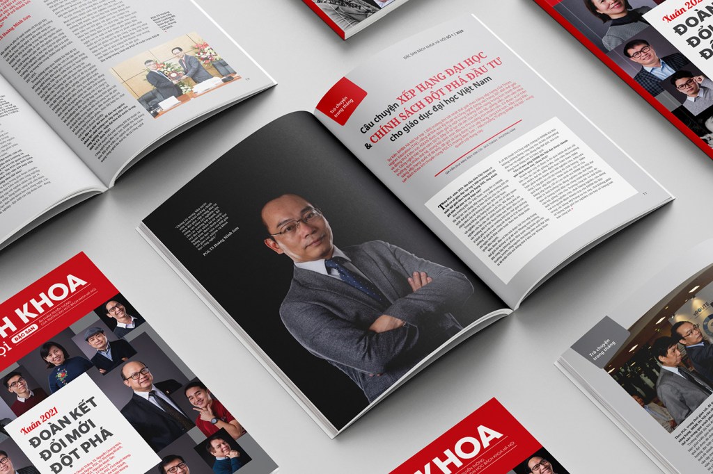
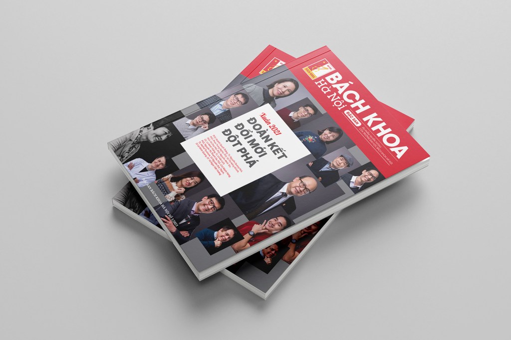
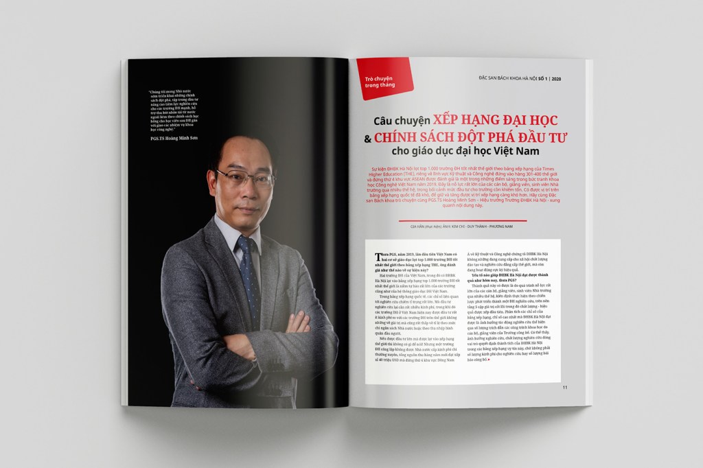
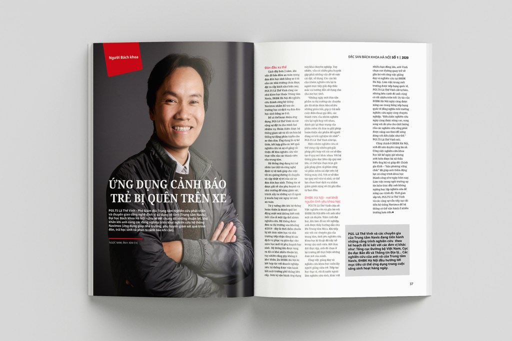
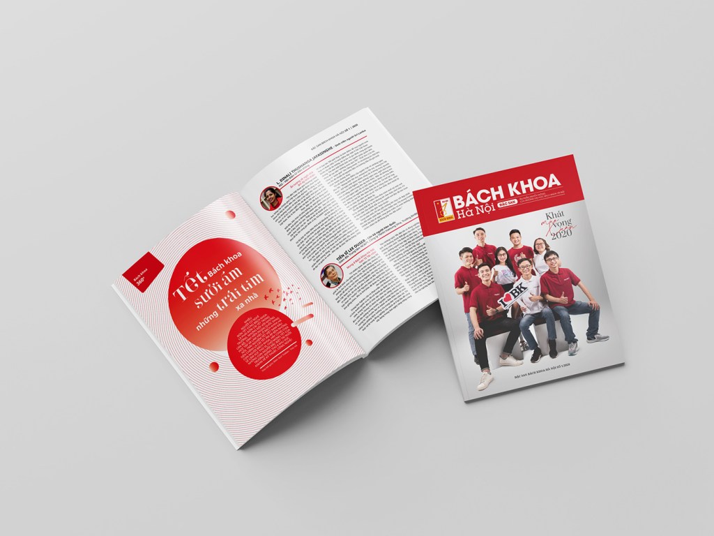
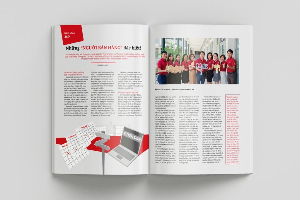
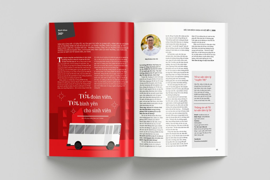
This publication reflects the University’s strategic vision and serves as a core expression of its brand identity, developed to highlight institutional strengths and values through cohesive messaging and imagery. The design aims to convey a 60-year heritage in a modern, engaging, and professional manner. By utilizing on-site illustrations, pull quotes, and strategic data points, the layout enriches the visual experience and provides multiple points of engagement for the reader. The implementation of an 11-column grid allows for diverse content structures within a single layout, offering flexibility for main articles while easily accommodating sidebars and captions through the effective use of white space. The Lato typeface was chosen for its standard of excellence, readability, and space-saving qualities, making it perfectly suited for the fields of education and technology. Furthermore, the University’s signature red is used as a consistent accent throughout the pages, complemented by a palette of gray tones to ensure a visually comfortable and sophisticated aesthetic.
![[IDENTITY/SOCIAL MEDIA/VIDEO] W-Square Cafe](https://indestudio.blog/wp-content/uploads/2023/11/97b10c120096035.60eeda45753ad.jpg?w=1024)
![[INDENTITY/VIDEO/MOTION]BEAUTY FRIEND – Korean Cosmetic eCommerce](https://indestudio.blog/wp-content/uploads/2023/11/d92e82119706419.60a37debd07ce-1.jpg?w=960)
![[WEB DESIGN] mEDISKINBYC KOREA](https://indestudio.blog/wp-content/uploads/2026/02/6648ff119708461.60a386f2a3702.jpg?w=1024)
![[PREMASTER PROJECT – APPROACH#2] PEOPLES OF VIETNAM](https://indestudio.blog/wp-content/uploads/2026/02/billboard-1.png?w=1024)
![[SOCIAL MEDIA/INFOGRAPHIC] Enrollment Campaign 2018 – Hanoi University of Science and Technology](https://indestudio.blog/wp-content/uploads/2026/02/477aeb120093109.60ab54fc9c284.png?w=1024)
![[EVENT IDENTITY] hUST – aLUMNI DAY 2019](https://indestudio.blog/wp-content/uploads/2026/02/f710dd119706029.60a37c6d2d99a.jpg?w=1024)
![[PRODUCT PHOTOSHOOT STYLING] nature Queen by Sao Thai Duong](https://indestudio.blog/wp-content/uploads/2026/02/5b51d459763019.60a21abc386c6.jpg?w=600)
![[EDITORIAL DESIGN] WISPER ‘Zomer 2024’ Zine](https://indestudio.blog/wp-content/uploads/2026/02/438711515_849640960533083_2077720051455650112_n.jpg?w=1024)
![[ART DIRECTOR / STYLING] Blossom in the Kitchen](https://indestudio.blog/wp-content/uploads/2026/02/d40dba119704691.60a3768d1a12b.jpg?w=600)
![[PRODUCT DESIGN/PACKAGING DESIGN] PHIN Coffee concept](https://indestudio.blog/wp-content/uploads/2026/02/gemini_generated_image_hz0gj8hz0gj8hz0g-1.png?w=1024)
![[EVENT IDENTITY] Asian Physics Olympiad (APhO) 2018](https://indestudio.blog/wp-content/uploads/2026/02/ddc86a119705547.60a37a471ddf0.jpg?w=1024)
![[FOUDER/OWNER] INDÉ STUDIO](https://indestudio.blog/wp-content/uploads/2026/02/ec80f643-8a96-4cdc-a025-2f1def66432f.jpg?w=1024)
![[PROPOSAL/ADVERTISING] Spring Shopping ’24 in Hasselt CampaignProposal](https://indestudio.blog/wp-content/uploads/2026/02/gemini_generated_image_9vxe8k9vxe8k9vxe.png?w=1024)
![[BOOK DESIGN] QANDA Books Compilation](https://indestudio.blog/wp-content/uploads/2026/02/aba4c9138332111.621ba2028f81c.jpg?w=1024)
![[MASTER PROJECT/VISUAL ARTS] LOOP & LEAP](https://indestudio.blog/wp-content/uploads/2026/02/gemini_generated_image_4yvk9c4yvk9c4yvk.png?w=1024)
![[PREMASTER PROJECT/ VISUAL IDENTITY] Vietnam Museum of Ethnology Visual Identity](https://indestudio.blog/wp-content/uploads/2023/11/poster_b2-06-3.jpg?w=1024)
![[PRODUCT DESIGN] Devyt x Hanote 50-year LIMITED EDITION](https://indestudio.blog/wp-content/uploads/2023/11/16b711119925169.60efed2789a21-1.jpg?w=1024)
